
[Time Series Forecasting] 판매량 예측하기 - EDA
🌈 Kaggle Playground
데이터는 Kaggle datasets, ‘Forecasting Mini-Course Sales’에서 다운 받아서 사용하였다.
데이터는 날짜, 국가, 매장, 제품, 판매량을 포함한다. 본 프로젝트의 목표는 주어진 데이터를 활용하여 2022년의 판매량을 예측하는 것이다.
1. 라이브러리 로드
import pandas as pd
import numpy as np
import matplotlib.pyplot as plt
import seaborn as sns

import koreanize_matplotlib
%config InlineBackend.figure_format = 'retina'
2. 데이터 로드
df = pd.read_csv('/kaggle/input/playground-series-s3e19/train.csv')
3. EDA
데이터를 이해하기 위해 탐색적 데이터 분석(Exploratory Data Analysis, EDA)을 진행하였다.
(1) 기술통계
# 데이터 요약용 함수
def summary(df):
    print(f'data shape: {df.shape}')
    describes = df.describe(include='all', datetime_is_numeric=True).T
    # summary용 dataframe 생성
    summary_df = pd.DataFrame(df.dtypes, columns=['data type'])
    summary_df['#unique'] = df.nunique().values
    summary_df['#missing'] = df.isnull().sum().values
    summary_df['%missing'] = df.isnull().mean().values * 100
    if 'min' in describes.columns:
        summary_df['min'] = describes['min'].values
        summary_df['max'] = describes['max'].values
        summary_df['mean'] = describes['mean'].values
        summary_df['std'] = describes['std'].values
    if 'top' in describes.columns:
        summary_df['top'] = describes['top'].values
        summary_df['freq'] = describes['freq'].values
    summary_df['1st value'] = df.loc[0].values
    summary_df['2nd value'] = df.loc[1].values
    summary_df['3rd value'] = df.loc[2].values
    return summary_df

summary(df)
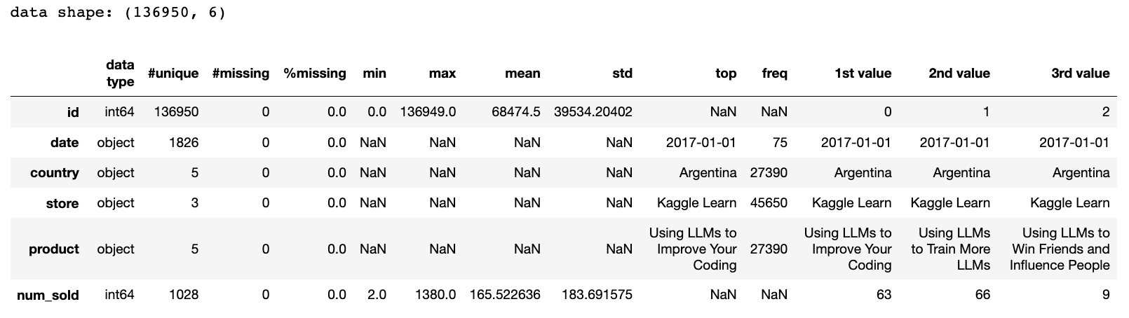
1-1. 수치형 데이터
id은 유일값으로 이루어졌다(0 ~ 136949 사이의 값을 가짐).num_sold를 보면 날짜, 나라, 매장, 상품별 판매량을 나타내는데 최솟값 2, 최댓값 1380, 평균 165.522636(≈ 166), 표준편차 183.691575(≈ 184)의 기술통계량을 가진다.
1-2. 범주형 데이터
date는 ‘연도-월-일’ 로 날짜를 표현하며 ‘2017-01-01’이 시작값이다.- object 타입을 datetime으로 변환하는 과정이 필요
- 판매추이를 확인해볼 필요가 있음
country,store,product는 categorical 데이터이다.- top을 보면 나라 ‘Argentina’, 매장 ‘Kaggle Learn’, 상품 ‘Using LLMs to Improve Your Coding’이 가장 많이 등장했음을 알 수 있다.
- 만약 등장한 횟수가 모두 동일하면 첫 번째 요소가 대표로 출력된다(확인해볼 필요가 있음).
- top을 보면 나라 ‘Argentina’, 매장 ‘Kaggle Learn’, 상품 ‘Using LLMs to Improve Your Coding’이 가장 많이 등장했음을 알 수 있다.
1-2-1. 구성요소 확인
# 범주형 데이터의 구성요소 확인하기
print(f"Country Component: {df['country'].unique()}")
print(f"Store Component: {df['store'].unique()}")
print(f"Product Component: {df['product'].unique()}")
Country Component: ['Argentina' 'Canada' 'Estonia' 'Japan' 'Spain']
Store Component: ['Kaggle Learn' 'Kaggle Store' 'Kagglazon']
Product Component: ['Using LLMs to Improve Your Coding' 'Using LLMs to Train More LLMs'
 'Using LLMs to Win Friends and Influence People'
 'Using LLMs to Win More Kaggle Competitions' 'Using LLMs to Write Better']
Country, Store, Product 컬럼의 각 구성 요소는 위 결과와 같다.
1-2-2. 빈도수 확인
# 범주형 데이터의 빈도수 구하기
print("=====Frequency by Country======")
print(df['country'].value_counts(), '\n')
print("=====Frequency by Store======")
print(df['store'].value_counts(), '\n')
print("=====Frequency by Product======")
print(df['product'].value_counts())
=====Frequency by Country======
Argentina    27390
Canada       27390
Estonia      27390
Japan        27390
Spain        27390
Name: country, dtype: int64

=====Frequency by Store======
Kaggle Learn    45650
Kaggle Store    45650
Kagglazon       45650
Name: store, dtype: int64

=====Frequency by Product======
Using LLMs to Improve Your Coding                 27390
Using LLMs to Train More LLMs                     27390
Using LLMs to Win Friends and Influence People    27390
Using LLMs to Win More Kaggle Competitions        27390
Using LLMs to Write Better                        27390
Name: product, dtype: int64
나라별, 매장별, 상품별 요소의 빈도 수가 모두 동일하다.
(2) datetime 형태 변환
# object 타입의 date를 datetime 로 변환한다.
df['date'] = pd.to_datetime(df['date'])

print(f"start date: {df['date'].min()}")
print(f"end date: {df['date'].max()}")
start date: 2017-01-01 00:00:00
end date: 2021-12-31 00:00:00
‘train.csv’는 2017-01-01 ~ 2021-12-31 의 판매 데이터(5년치)를 포함한다.
(3) 판매추이
# 그래프용 색상 정의
color = '#efb0b3'
colors = ['#B5CDE4', '#FBB4AE', '#CCEBC6', '#DFCCE4', '#FFD9A6']
3-1. 시간에 따른 판매량
daily_sales = df.groupby(by='date')['num_sold'].agg('sum')
daily_sales.plot(title='Trend of Sales Over Time', xlabel='Date', ylabel='#Products sold',
                 figsize=(12, 4), color=color);
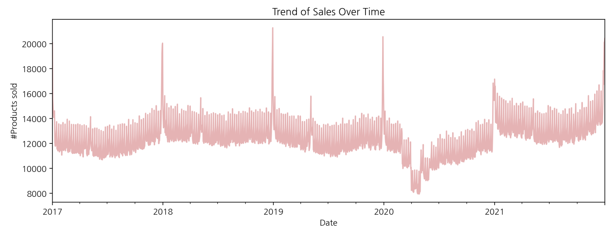
그래프를 보면, x값이 2018, 2019, 2020, 2021 부근에서 판매량이 급격히 증가하는 것으로 보인다(계절성이 있는 것으로 판단됨). 2020년 1분기쯤에서 판매량이 급격히 감소하는데 이는 외부요인으로 인한 현상으로 생각된다(2020년에는 코로나 등 사회적 이슈가 판매에 직접적인 영향을 줌). 소비의 행태가 이커머스 시장으로 확장되었기 때문이다.
3-2. 월별 판매량
monthly_sales = df.resample(rule='M', on='date').sum()['num_sold']
monthly_sales.plot(title='Monthly Sales Trend', xlabel='Date', ylabel='#Products sold',
                   figsize=(12, 4), color=color);
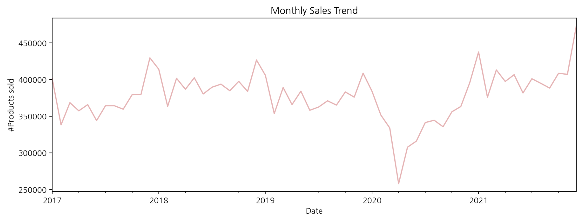
resample 함수를 사용하면 날짜 데이터를 특정 규칙(특정 주기)을 기준으로 구간별 집계가 가능하다. rule에 ‘M’을 전달하면 날짜가 해당 월의 마지막 날짜로 변환되고 월별 마지막 일자를 기준으로 총 판매량을 집계하였다. 월별 총 판매량 그래프를 보면 판매되는 제품의 수가 전반적으로 증가하는 것으로 보인다.
3-3. 연월별 판매량
monthly_year_sales = monthly_sales.reset_index()
monthly_year_sales['year'] = monthly_year_sales['date'].dt.year
monthly_year_sales['month'] = monthly_year_sales['date'].dt.month

plt.figure(figsize=(10, 5))
sns.lineplot(data=monthly_year_sales, x='month', y='num_sold', hue='year')
plt.title('Monthly Sales for Each Year')
plt.xlabel('Month')
plt.ylabel('#Products sold')
plt.show();
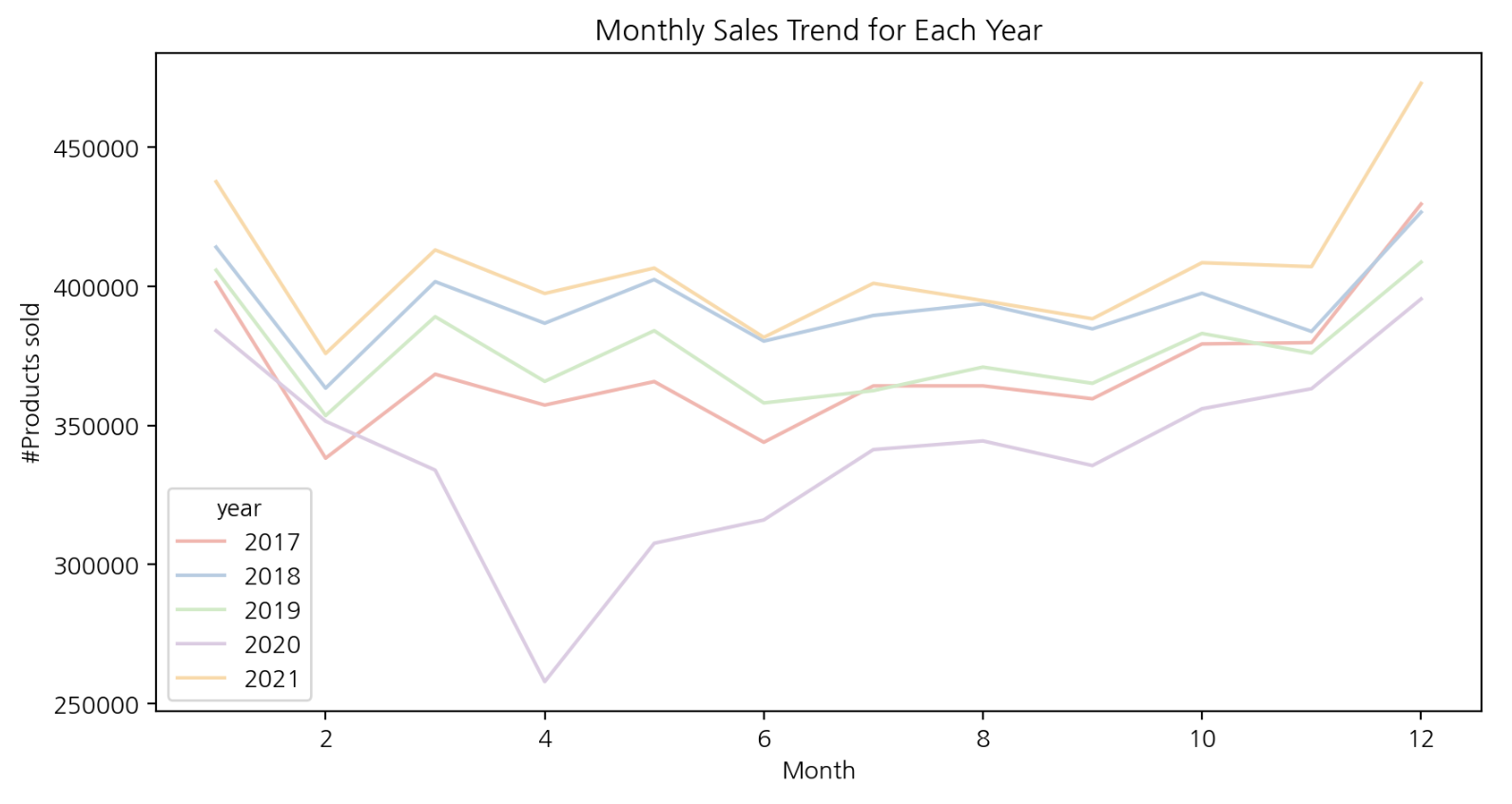
각 연도별로 월별 판매량을 그래프로 그려보았을 때, 총 판매량이 비슷한 추세를 가지고 있음을 알 수 있다. 매년 상품이 가장 많이 판매되는 달은 1, 12월이다.
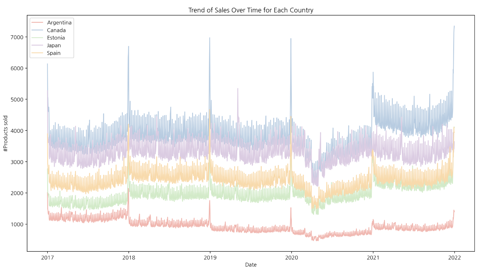
(4) 나라별 판매추이
나라별(‘Argentina’ ‘Canada’ ‘Estonia’ ‘Japan’ ‘Spain’) 판매 추이를 확인해보고자 한다.
country_sales = df.groupby(by=['country', 'date']).sum()['num_sold'].reset_index()

plt.figure(figsize=(15, 8))
sns.lineplot(data=country_sales, x='date', y='num_sold', hue='country', palette='Pastel1')
plt.title('Trend of Sales Over Time for Each Country')
plt.xlabel('Date')
plt.ylabel('#Products sold')
plt.legend()
plt.show();
4-1. 월별 판매량
country_monthly_sales = df.groupby(by=[df['date'].dt.to_period('M'), 'country']).sum()['num_sold'].reset_index()
country_monthly_sales['date'] = country_monthly_sales['date'].dt.to_timestamp()

plt.figure(figsize=(15, 6))
sns.lineplot(data=country_monthly_sales, x='date', y='num_sold', hue='country', palette='Pastel1')
plt.title('Monthly Sales Trend for Each Country')
plt.xlabel('Date')
plt.ylabel('#Products sold')
plt.legend()
plt.show();
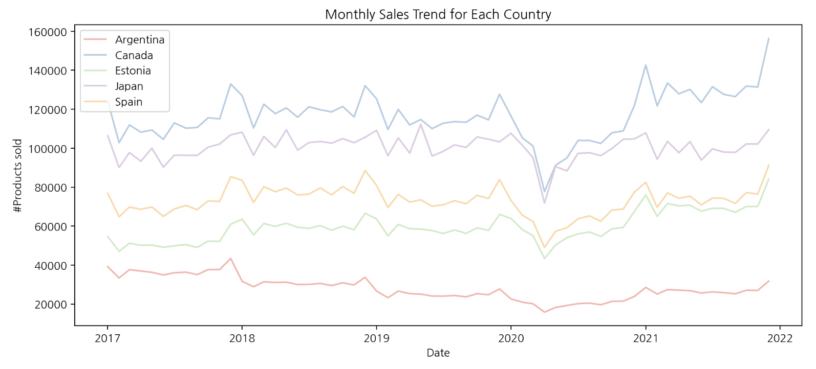
월별, 나라별로 데이터를 집계한 결과를 보면 나라별 판매 추이가 비슷하다는 것을 알 수 있다. 상품 판매량은 아르헨티나에서 가장 저조하며 주요 시장인 캐나다와 약 3배 이상 차이나는 것으로 보인다.
- 판매량이 높은 국가(주요 시장): 캐나다, 일본
- 판매량이 안정적인 국가: 에스토니아, 스페인
- 판매량이 저조한 국가(침체): 아르헨티나
4-2. 상품별 판매량
contry_product_sales = df.groupby(by=['country', 'product']).sum()['num_sold'].reset_index()

fig, axs = plt.subplots(5, 1, figsize=(15, 40))

for i, country in enumerate(countries):
    cps = contry_product_sales[contry_product_sales['country'] == country]
    axs[i].bar(cps['product'], cps['num_sold'], alpha=0.5, color=colors[i], label=country)
    axs[i].set_title(f'Total Sales in {country} by Product')
    axs[i].set_xlabel('Product')
    axs[i].set_ylabel('#Product sold')
    axs[i].legend()
    axs[i].tick_params(axis='x', rotation=15)

plt.tight_layout()
plt.show();
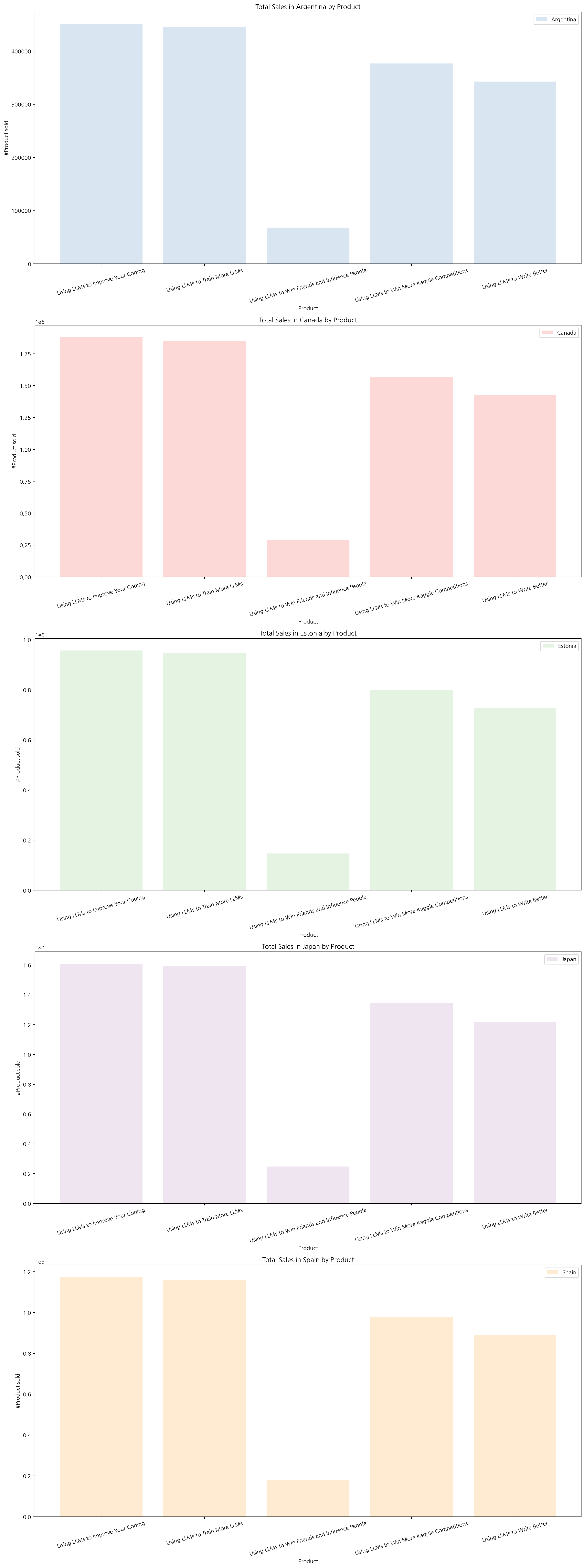
나라별로 어떤 상품이 주로 판매되는지 시각화해 보았다. 주력 상품과 비주력 제품이 모든 국가에 대해 동일하게 나왔다.
- 주력 상품:
- ‘Using LLMs to Improve Your Coding’
- ‘Using LLMs to Train More LLMs’
- 비주력 상품:
- ‘Using LLMs to Win Friends and Influence People’
위 상품 목록에는 포함하지 않았지만 ‘Using LLMs to Win More Kaggle Competitions’, ‘Using LLMs to Write Better’ 또한 주력 상품의 한 종류로 포함시킬 수 있다(판매량이 높음).
(5) 상품별 판매추이
# 매장별, 일자별 총 판매량
store_sales = df.groupby(by=['store', 'date']).sum()['num_sold'].reset_index()

plt.figure(figsize=(15, 8))
sns.lineplot(data=store_sales, x='date', y='num_sold', hue='store', palette='Pastel1')
plt.title('Trend of Sales Over Time for Each Store')
plt.xlabel('Date')
plt.ylabel('#Products sold')
plt.legend(loc='upper left')
plt.show();
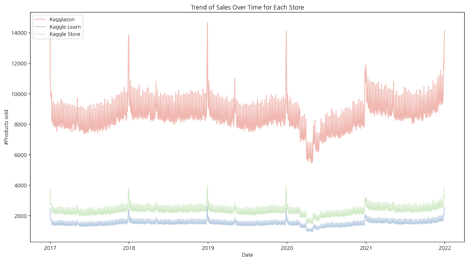
시각화한 결과를 보면 매장별로 시간에 따른 추세가 비슷하다는 것을 알 수 있다. 그리고 상품의 판매가 ‘Kagglazon’에서 대부분 일어난다는 점도 알 수 있다.
(6) 카테고리별 판매 비율
# 부채꼴 모양의 파이 그래프 설정
wedgeprops={'width': 0.8, 'edgecolor': 'w', 'linewidth': 5}
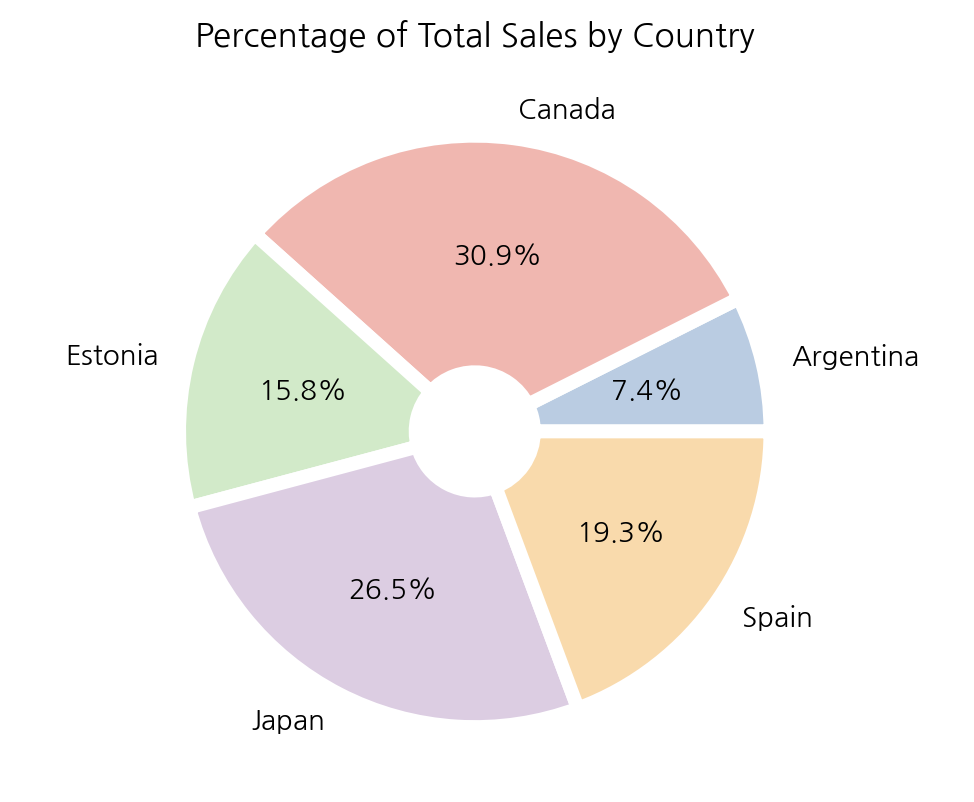
6-1. 국가별 판매 비율
total_country_sales = df.groupby(by='country').sum()['num_sold']

plt.pie(total_country_sales, labels=total_country_sales.index,
        autopct='%.1f%%', colors=colors, wedgeprops=wedgeprops)
plt.title('Percentage of Total Sales by Country')
plt.show();
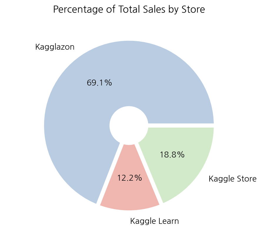
6-2. 매장별 판매 비율
total_store_sales = df.groupby(by='store').sum()['num_sold']

plt.pie(total_store_sales, labels=total_store_sales.index,
        autopct='%.1f%%', colors=colors, wedgeprops=wedgeprops)
plt.title('Percentage of Total Sales by Store')
plt.show();
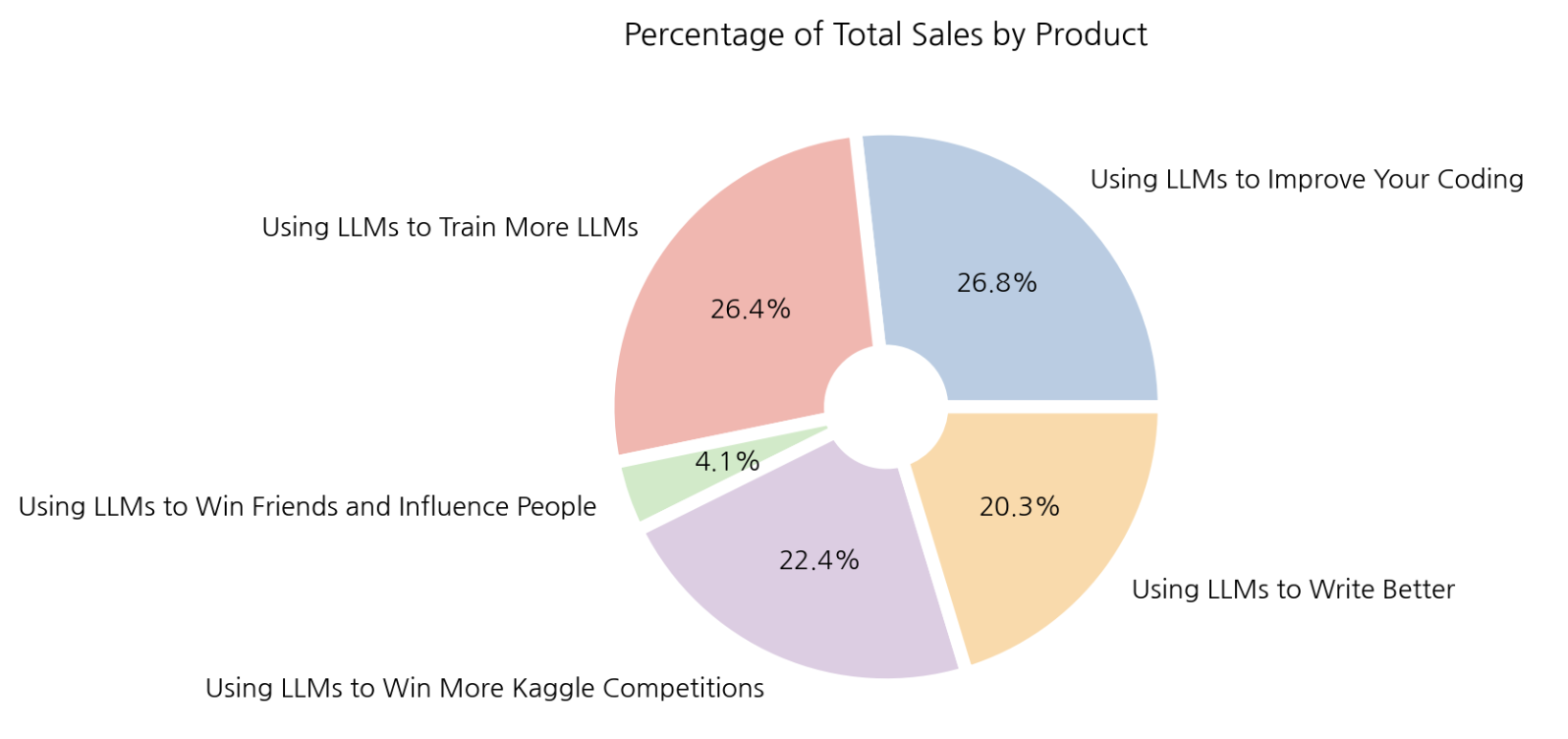
6-3. 제품별 판매 비율
total_product_sales = df.groupby(by='product').sum()['num_sold']

plt.pie(total_product_sales, labels=total_product_sales.index,
        autopct='%.1f%%', colors=colors, wedgeprops=wedgeprops)
plt.title('Percentage of Total Sales by Product')
plt.show();
4. 결론
해당 데이터셋으로 EDA를 수행한 결과를 정리해 보았다.
(1) 판매 추이
계절성을 가지고 있으며 시간이 지남에 따라 상품의 판매량이 증가하는 것으로 보인다. 다만 2020년에는 이전연도 대비 판매량이 급격히 감소하였는데 이는 Covid-19 로 인해 소비 행태가 변한 것이 판매량 감소의 주 원인인 것으로 예상된다.
(2) 주요 시장
국가별 판매추이를 보면 모든 국가가 시간에 따른 판매량 변화의 형태가 비슷하다. 해석해 보면, 국가별로 시간에 따른 판매 추세는 비슷하지만 국가별로 판매되는 규모의 크기는 분명한 차이를 보인다. 가장 많은 판매량을 보이는 국가는 Canada이고 가장 낮은 판매량을 보이는 국가는 Argentina 이다. 두 나라간 시장의 차이는 약 3배 이상인 것으로 보인다. 효과적인 마케팅 활용, 수요 높은 제품 발굴 등을 제안해볼 수 있다.
(3) 매장, 제품별 판매량
매장별 총 판매량을 파이 플롯으로 그려보았을 때 ‘Kagglazon’ 이 69.1%로 압도적인 1위이다. 나머지 두 매장의 합보다 2배 더 높은 매출을 보이고 있으며 이런 차이는 매장별 제품의 디스플레이 방식, 배송 관련 이슈, 접근성 등의 이유가 원인일 수 있다.
제품별 총 판매량을 파이 플롯으로 그려보았을 때 ‘Using LLMs to Win Friends and Influence People’을 제외한 나머지 4개의 항목은 비슷한 판매량을 보인다.
👩🏻💻개인 공부 기록용 블로그입니다
오류나 틀린 부분이 있을 경우 댓글 혹은 메일로 따끔하게 지적해주시면 감사하겠습니다.
댓글남기기